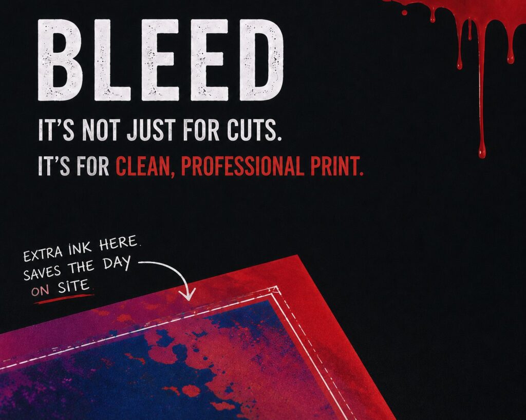
Ever seen a print job that looked perfect on screen but ended up with a white edge, a short panel, or a finish that just felt slightly off once installed?…
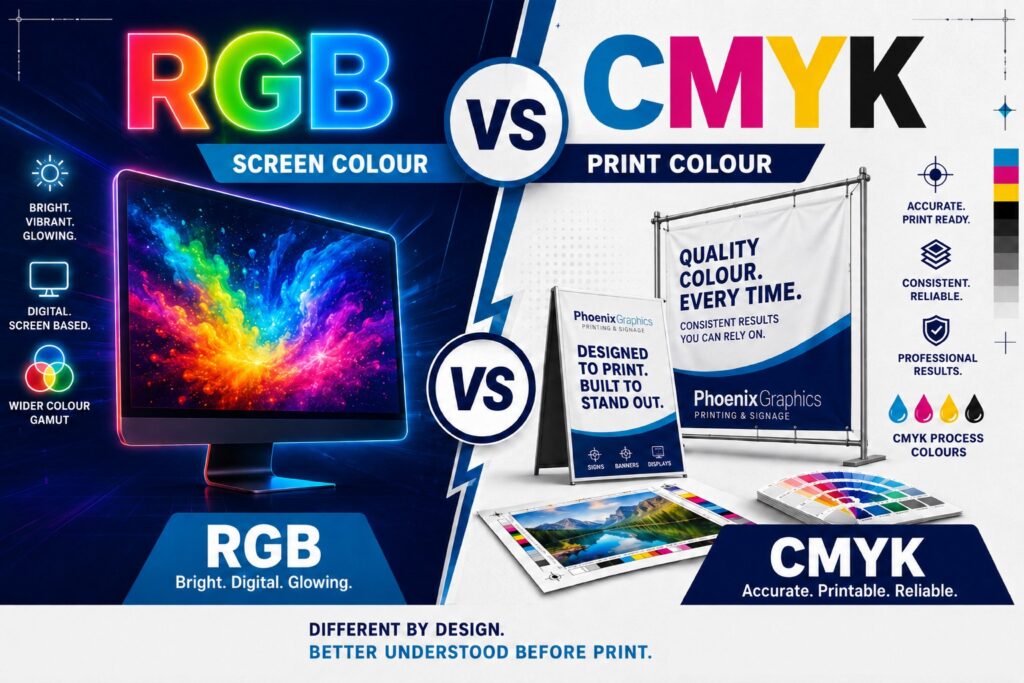
You sign off on your artwork, feeling confident the colours look sharp, vibrant, and exactly on brand. Then the printed version arrives and something feels off. The blue looks duller,…
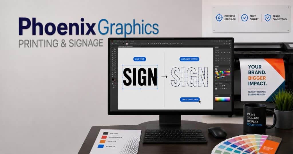
Why You MUST Outline Fonts for Print Before Sending Artwork Ever approved a proof only to see your final print come back looking “off”? One of the simplest ways to…
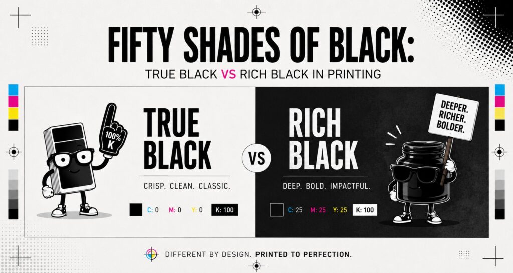
You’d be forgiven for thinking black is just… black. Nice, simple, no drama. But when it comes to print, black has a surprisingly split personality. Understanding True Black vs Rich…