You sign off on your artwork, feeling confident the colours look sharp, vibrant, and exactly on brand. Then the printed version arrives and something feels off. The blue looks duller, the red seems heavier, or the whole design just lacks the punch it had on screen. This is one of the most common frustrations in digital printing, and it often comes down to one critical detail: file setup. Using the right CMYK setup on artwork files for digital printing helps your design translate more accurately from screen to print, reducing colour surprises, delays, and costly reprints. For signage, event graphics, stickers, school materials, and branded displays, that simple step can make a very big difference.
What CMYK Actually Means
CMYK stands for Cyan, Magenta, Yellow, and Key (Black). These four ink colours are the foundation of most professional print production.
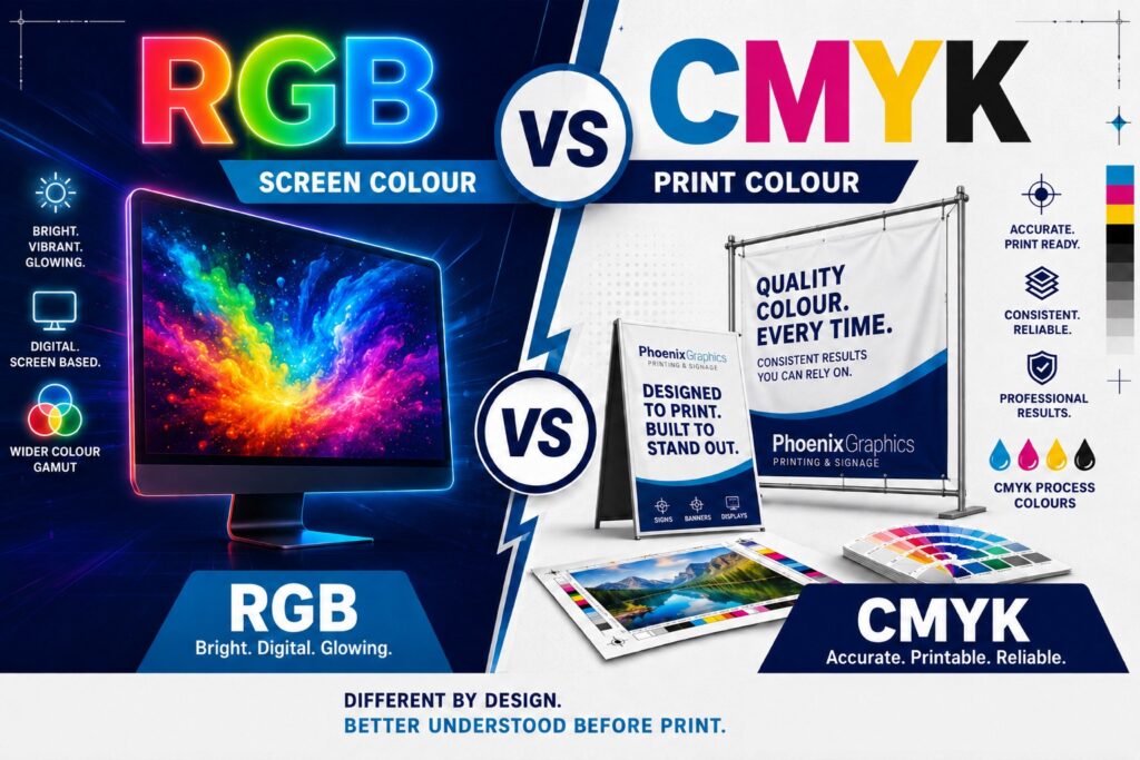
By contrast, screens use RGB: Red, Green, and Blue. RGB creates colour with light, while CMYK creates colour with ink. That means what looks brilliant on a monitor is not always possible to reproduce exactly on a printed surface.
This is why the CMYK setup on artwork files for digital printing matters so much. It helps you design inside the colour range that print equipment can realistically produce.
Why RGB Creates Problems in Print
A lot of files are created in RGB without anyone thinking twice. It is the default for many digital design environments, and for web graphics, presentations, or social posts, that is completely fine. But for digital printing, RGB can create avoidable problems.
Here is why:
- RGB has a wider visible colour range on screen
- Some bright tones cannot be matched perfectly in CMYK ink
- Automatic conversion can shift colours in unexpected ways
- Brand colours may print inconsistently across different items
This is where disappointment often starts. A vibrant electric blue may print flatter. A bright green can lose its energy. A bold gradient may become muddy or uneven. If you are printing marketing graphics, event signage, school visuals, or safety messaging, those shifts can affect both quality and credibility.
The Real Benefits of Using CMYK from the Start
Setting up artwork correctly in CMYK is not just a technical preference. It is a practical way to protect the quality of your project and avoid unnecessary issues during production.
Using the CMYK setup on artwork files for digital printing helps with:
- More accurate colour expectations
You are working closer to the final printed result, not just what looks good on a backlit screen. - Better consistency across materials
Whether your design is going on vinyl, fabric, corflute, PVC, stickers, or rigid substrates, CMYK gives the printer a more reliable starting point. - Cleaner brand presentation
Businesses rely on consistent colours across signage, decals, displays, and promotional assets. CMYK helps support that consistency. - Fewer last-minute fixes
Good setup early can reduce revisions, proofing problems, and stressful surprises just before deadline. - Lower reprint risk
When colour expectations are realistic from the start, there is less chance of needing expensive corrections later.
Why CMYK Matters Even More for Large or High-Visibility Print Jobs
Not every print project is equally sensitive to colour variation. But when the final piece is going to be highly visible, customer-facing, or installed in a professional environment, colour accuracy becomes much more important.
This includes projects like:
- Event and festival signage
- School branding and directional signage
- Safety and compliance signage
- Retail promotional displays
- Wall graphics and window decals
- Branded stickers and packaging elements
In these situations, the goal is not just to get something printed. The goal is to get something printed that looks professional, consistent, and fit for purpose. That is why the CMYK setup on artwork files for digital printing should be treated as part of the quality process, not an afterthought.
At Phoenix Graphics, that quality process is shaped by experience. With over 30 years in print and project delivery, the team works closely with clients to make sure the product suits the environment, material, timeline, and visual goal, not just the file specification.
Common Artwork Mistakes That Lead to Colour Issues
Using CMYK is one of the most important steps, but it is not the only one. There are a few other file setup mistakes that often cause trouble in digital printing.
Watch out for:
- Supplying artwork in RGB instead of CMYK
- Using low-resolution images
- Forgetting bleed and crop settings
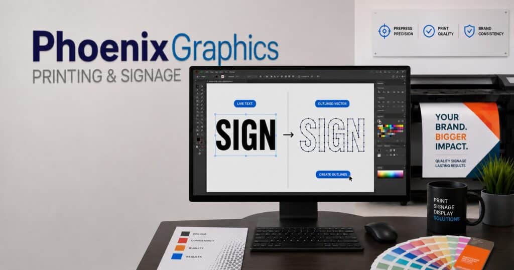
- Not converting or outlining fonts
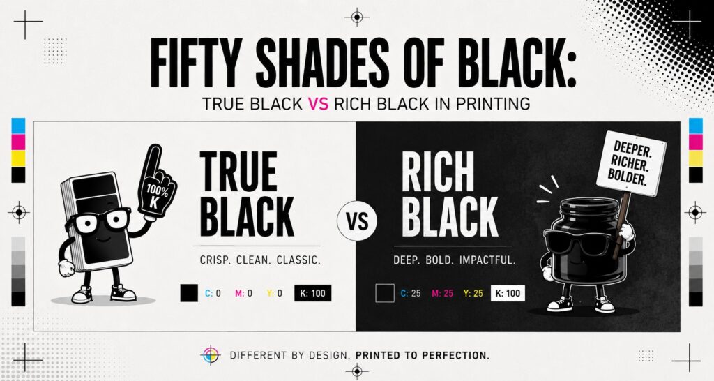
- Building rich black incorrectly
- Assuming screen brightness will match print appearance
These issues can slow production and reduce print quality, especially on larger or more complex jobs. That is why working with a consultative print partner can be so valuable. A good team will spot problems early, explain what needs adjusting, and help avoid preventable mistakes.
[Artwork Setup Guide for Print Projects]
Need a Second Set of Eyes on Your Artwork?
Phoenix Graphics helps clients get print-ready with less guesswork and better results. From colour setup and substrate advice to production and installation, we provide reliable, honest support for projects across the Gold Coast, Brisbane, and all of Australia.
- Ask us to review your artwork before it goes to print
- Get expert help with signage, event graphics, compliance materials, and large-format printing
- Read our other blog, “Fifty Shades of Black“, explaining more about printing Black
Getting the colour right in print starts long before the printer is switched on. When your artwork is built in the correct format, your project has a much better chance of looking polished, professional, and true to expectations. If you want expert guidance and dependable results, Phoenix Graphics is ready to help you turn the right file setup into the right finished product.
Frequently Asked Questions
Q: Can I still print a file that was created in RGB?
A: Yes, but it will usually need to be converted for print. That conversion can change colours in ways you may not expect, which is why CMYK is the safer choice for professional printing.
Q: Does CMYK always look duller than RGB?
A: Not always duller, but often less bright than a screen display. RGB uses light, so it can show more intense colours. CMYK gives you a more realistic view of what can actually be printed.
Q: Is CMYK important for large-format digital printing too?
A: Absolutely. For banners, signs, decals, display graphics, and other large-format pieces, proper CMYK setup helps improve consistency, colour control, and final output quality.
Written by Phoenix Graphics