Why Your Commercial Signage For Business Front Might Be Letting You Down
I get asked a lot of questions by event managers, school principals, procurement managers and marketing teams who are about to spend real money on signage and just want to get it right the first time, and I always tell people the same thing, which is that good commercial signage for business front spaces should not be a guessing game, and the mistakes that cost people money are usually the same handful of mistakes repeated over and over, and once you know what to look for you can avoid most of them before a single file goes to print, so I thought it would be useful to walk through the five we see most often and talk honestly about how to fix them, because that is the kind of conversation I would rather have with a client than a sales pitch.
Mistake One, Text That Nobody Can Actually Read From The Road
The first mistake and probably the most common one is signage that looks great on a laptop screen and then becomes completely unreadable once it is sitting above a shopfront or beside a driveway, and this happens because the font is too small or too decorative or the colours do not contrast enough against the background, and a driver or a visitor only gets a second or two to register your sign before they have moved past it, so if they have to slow down or squint then the sign has already failed at its one job, and the fix is simple in theory even if it takes some back and forth in practice, which is to use clean strong fonts, keep contrast high between the text and the background, and size everything for the actual viewing distance rather than how it looks zoomed in on a screen, and this is exactly the kind of thing we talk through with clients before we even start designing, because a business front sign that cannot be read is not doing any work for the business at all.
Mistake Two, Hiding The Sign Where Nobody Is Looking
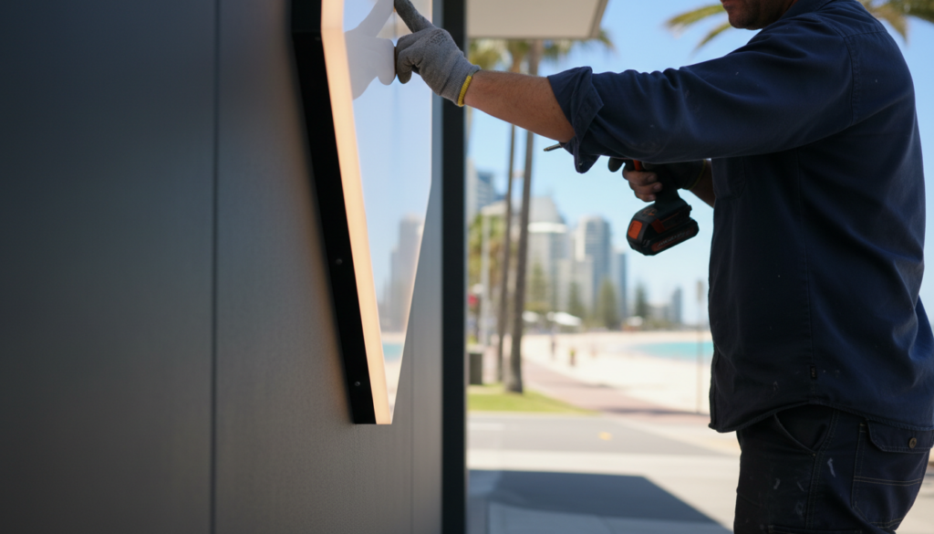
The second mistake is placement, and I see this more than people expect, where a perfectly good sign gets installed behind a tree, too high above eye line, or tucked around a corner where foot traffic never actually passes, and for schools and councils this matters just as much as it does for retail, because a wayfinding sign that is technically correct but positioned where parents or visitors are not looking is just as useless as having no sign at all, and the fix is to physically walk the site the way a first time visitor would, checking entrances, intersections, car parks and pickup points, and that is something our installers flag constantly because they see the site in a way a design file on a screen never shows you.
Mistake Three, Trying To Say Everything On One Panel
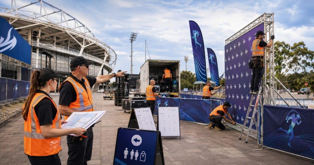
The third mistake is cramming too much information onto a single sign, and I understand the instinct because everyone wants their sign to do as much work as possible, but when you try to fit a full service list, contact details, trading hours and a safety notice all onto the same panel, people stop reading altogether, and the fix is to pick one clear message per sign and let supporting details sit on a second or third panel if they are genuinely needed, which is the same advice we give event managers planning signage for a bump in, where directional, sponsor and safety messaging all need their own space to actually land, and if you want more detail on that we have gone through it properly in 5 Event Signage Mistakes That Can Derail Your Bump In.
Mistake Four, Sending Us A File That Was Never Built For Large Format
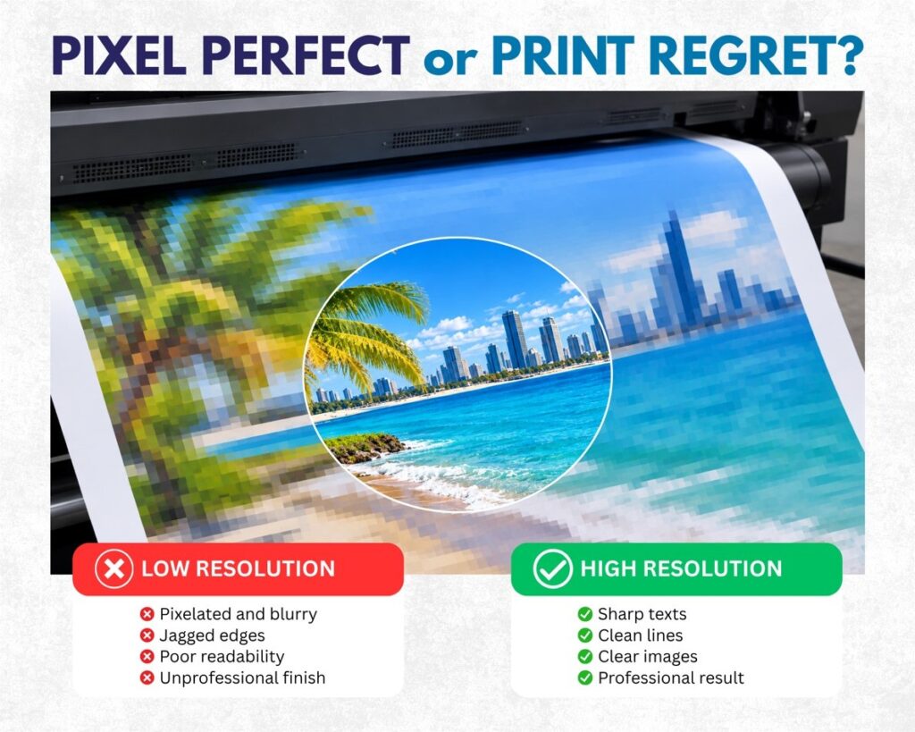
The fourth mistake sits further back in the process, before the sign is even installed, and it is sending through artwork that was never built for large format printing in Queensland conditions, meaning low resolution logos, missing bleed, or colours set up for a screen rather than for CMYK print, and the result is pixelated edges, white slivers around the artwork, or colours that come out duller or completely different to what was expected on screen, and this is genuinely one of the easiest mistakes to avoid because it is purely a file setup issue, so we always check bleed and colour mode before anything goes to the printer, and if that sounds a bit technical we have broken it down plainly in Too Close For Comfort, Why Print Files Need Bleed, because nobody should need a design degree to understand why their sign came out with a white edge around it.
Mistake Five, Signage That Does Not Match Anything Else The Business Uses
The fifth mistake is inconsistency, where the shopfront sign uses one shade of the brand colour, the banner at an event uses another, and the vehicle signage uses something else entirely, and over time this quietly erodes how recognisable and trustworthy a business or organisation looks, which matters just as much for a school trying to present a unified campus as it does for a company managing signage across several sites, and the fix really just comes down to having a single reference point, logo files, colours and preferred materials, that every sign gets checked against before it goes to print, which is part of why so many of our long term clients just send a brief and let us check it against what we have produced for them before.
A Quick Real World Example
To make this practical, picture two options for the same job, a new office front sign for a growing business. Option A is a rush job where the logo file gets pulled straight off the website, the text is sized to fit the panel rather than the viewing distance, and the sign goes up without anyone walking the site first, and within a few months the business is asking why visitors keep walking past the entrance. Option B is the same budget but the file gets checked for resolution and bleed before printing, the text size gets tested against the actual distance people will be standing or driving from, and someone walks the site to confirm the sign will not end up behind a hedge in six months once the landscaping grows in, and the second option almost always ends up cheaper over time because nobody is paying twice to fix the same sign.
Where This Matters Most For Our Clients
This comes up constantly with school signage across Australia, where safety and wayfinding genuinely cannot afford to be an afterthought, with construction and safety signage where legibility is a compliance issue as much as a design one, and with event signage for councils and sporting events on the Gold Coast where a sign only gets one shot at being seen in a busy environment, and in every one of those situations the mistakes are the same five we have just gone through, just wearing different hats depending on the industry.
Our strength has always been communication and the years of knowledge we bring to a project before it ever reaches print, and we would genuinely rather spend twenty minutes talking through placement, materials or file setup with a client than have them discover a mistake once a sign is already installed, because there is never a stupid question in that conversation, only ones we have not got to yet, so if you are planning signage for a business front, a school, a construction site or an event and you want someone to sense check it before it goes to print, please sing out to me and we will pop more information your way and talk through the best options for your project.