You’d be forgiven for thinking black is just… black. Nice, simple, no drama. But when it comes to print, black has a surprisingly split personality. Understanding True Black vs Rich Black in printing can make a big difference to how your artwork looks once it comes off the press. Use the wrong one, and your crisp text can turn fuzzy or your bold black background can look a little underwhelming. Use the right one, and your artwork looks cleaner, sharper, and far more professional. If you’re preparing files for signs, posters, stickers, event graphics, or display materials, this guide will help you understand when to use each black and why it matters.
What Is True Black?
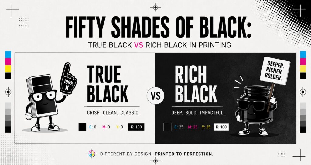
True Black is the simplest black you can create in CMYK. It uses:
- Cyan: 0
- Magenta: 0
- Yellow: 0
- K|Black: 100
That means it’s made with black ink only, with no added cyan, magenta, or yellow.
True Black is the go-to option for anything that needs to print cleanly and sharply. Because it’s only using one plate, there’s less chance of misregistration. That’s print-speak for those annoying moments when colours don’t line up perfectly and your text suddenly looks like it had one too many coffees.
True Black is best for:
- Small text
- Fine lines
- Detailed logos
- Barcodes and QR codes
- Body copy in brochures, flyers, and signage
If the element needs to be easy to read and nicely defined, True Black is usually your safest bet.
What Is Rich Black?
Rich Black is a deeper, fuller black created by combining black ink with additional CMY values. For this blog, we’re using a balanced rich black made up of:
- C: 25
- M: 25
- Y: 25
- K: 100
This mix gives black areas a stronger, denser appearance, especially across larger printed surfaces. Instead of looking a bit flat, Rich Black adds more visual weight and depth.
That’s where True Black vs Rich Black in printing becomes important. One is better for crisp detail, while the other is built for bold impact.
Rich Black is best for:
- Large black backgrounds
- Posters
- Pull-up banners
- Event and exhibition graphics
- Display panels
- Marketing materials with heavy black areas
If you’re filling a big section of your design with black, Rich Black will usually give you a more polished and premium-looking result.
So, What’s the Actual Difference?
The easiest way to understand True Black vs Rich Black in printing is this:
- True Black is for sharpness
- Rich Black is for depth
They may look similar on screen, but in print they behave very differently.
Here’s the simple rule of thumb:
- Use True Black for small, detailed, or text-based elements
- Use Rich Black for large solid areas that need to look darker and fuller
Why not use Rich Black everywhere? Because it uses four ink values instead of one. That means small text and fine detail are more likely to show slight registration issues, which can make edges look soft or fuzzy.
Why not use True Black everywhere? Because on large filled areas, it can sometimes appear more greyish or washed out than expected.
A good print-ready file often uses both blacks in different places. Yes, black can be high maintenance. We don’t make the rules.
When Should You Use True Black?
Use True Black when readability and precision matter most.
This includes:
- Text under about 24 pt
- Thin strokes and rules
- Fine icon details
- Instructional signage
- Safety and compliance signs
- School signage with important information
- Logos with delicate black elements
This is especially important if your artwork includes anything functional, such as wayfinding, safety messaging, or detailed information. In those cases, clarity beats drama every time.
One of the most common artwork issues we see is text that has been set up as Rich Black instead of True Black. It might look perfectly fine on your monitor, but on the printed piece it can lose that crisp edge you actually need.
When Should You Use Rich Black?
Use Rich Black when you want black to feel bold, solid, and visually strong.
It’s ideal for:
- Large background blocks
- Big headline areas
- Event signage
- Wall graphics
- Retail displays
- Presentation boards
- Large-format promotional graphics
When black covers a bigger area, using only 100% K can sometimes leave it looking flatter than the rest of the design. Rich Black helps give those larger spaces more punch.
That said, not every print application behaves exactly the same way. Material, finish, printer type, and ink limits can all affect the final result. That’s why it’s worth checking your artwork setup before going into production, especially for more complex or high-visibility jobs.
Common Mistakes to Avoid When Setting Up Black
If you’re preparing artwork for print, here are a few black-related traps to avoid:
- Using Rich Black for small text
This can make type look fuzzy or harder to read. - Using True Black for large solid backgrounds
The black may appear flatter or less intense than you expected. - Mixing different black builds by accident
Two black areas in the same design can end up looking noticeably different. - Working in RGB instead of CMYK
What you see on screen won’t always match what prints, especially with darker tones. - Assuming all Rich Black formulas are the same
Different printers may recommend different builds depending on the application.
A quick artwork check before print can save a lot of time, money, and “wait, why does that look weird?” later on.
Need a Hand Getting Your Artwork Print-Ready?
If you’re not sure whether your file needs True Black, Rich Black, or a few small tweaks before print, we can help.
At Phoenix Graphics, we take a consultative approach to every job. That means we don’t just print what lands in our inbox and hope for the best. We work with you to make sure your artwork is set up properly for the material, environment, and end use—so the finished product looks right the first time.
- Send us your artwork for a pre-print review
- Talk to our team about the best setup for your signs, displays, stickers, or event graphics
Frequently Asked Questions
Q: What is the difference between True Black and Rich Black in printing?
A: True Black is made from 100% K only, while Rich Black combines black with additional CMY values for a deeper, fuller appearance. True Black is best for text and fine details, while Rich Black is better for large solid areas.
Q: What CMYK should I use for Rich Black?
A: A common balanced Rich Black setup is C: 25, M: 25, Y: 25, K: 100. This creates a darker, more even black for large areas without overloading the file unnecessarily.
Q: Can I use Rich Black for all black elements in my artwork?
A: It’s not recommended. Rich Black works well for large fills, but smaller text and fine detail should usually stay as True Black for the sharpest print result.
Once you understand True Black vs Rich Black in printing, preparing artwork becomes a whole lot easier. It’s one of those small technical details that can have a big impact on the final result. Choosing the right black helps your design look sharper, more consistent, and better suited to the way it will actually be used. If you’d like a second opinion before sending your file to print, Phoenix Graphics is always happy to help make sure everything is set up properly from the start.
Written by Phoenix Graphics Team


